
Lieven de Key HQ
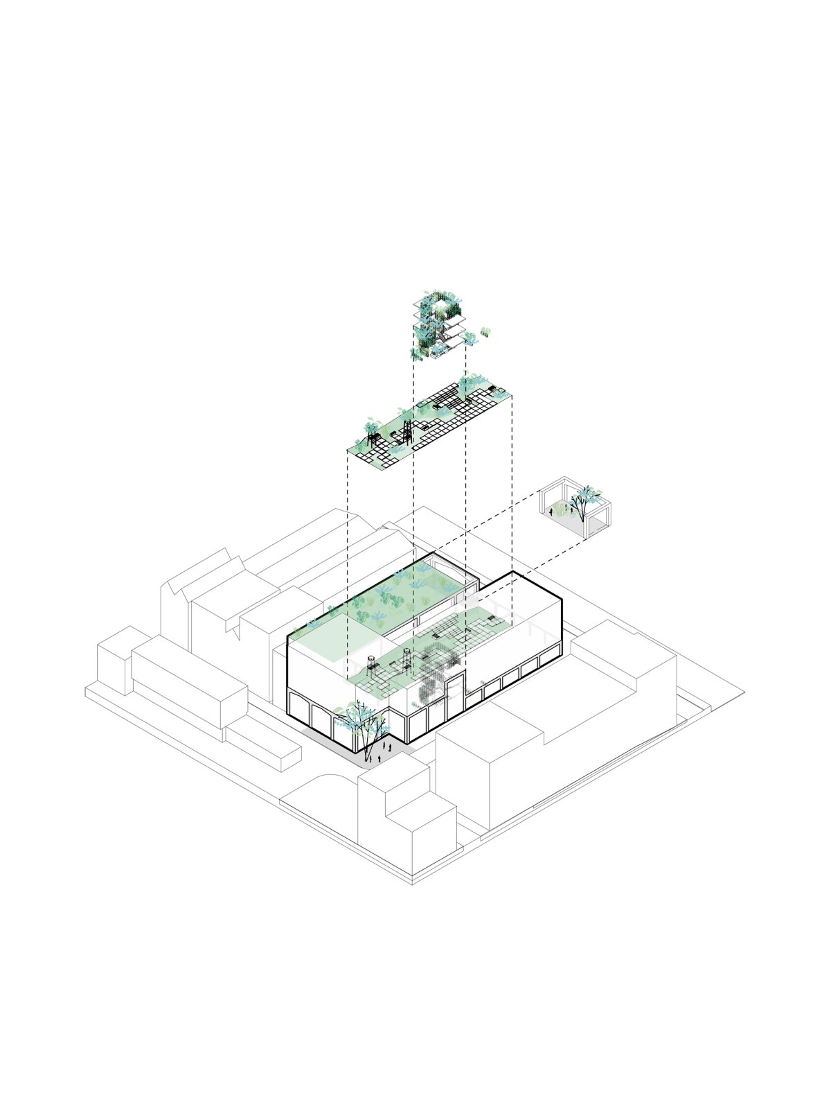
We transformed the existing office of housing corporation Lieven de Key in Amsterdam into a sustainable and future-proof headquarters. The corporation’s two branches were efficiently merged into the existing building on the Hoogte Kadijk, additionally creating space for new social housing on the site of the other office.
The outdated interior of the original office buildings has made way as much as possible for a transparent and surprising office environment, in line with Lieven de Key’s modern ambitions. The newly created spaces provide room for spontaneous interactions and happenings, and are subject to an open interpretation in function. The flexible office concept, natural materials, an abundance of daylight and the plenty of greenery introduced around and in the building prepare the housing association for the future.
Project details
Client
Lieven de KeyType
Re-use of 5.000m2 office space, restaurant, lab and gardenCertificate
BREEAM-NL In-use: ExcellentLocation
Hoogte Kadijk, Amsterdam, NLDesign-Completion
2017-2022Partners
DZAP, Het Groenlab, Techniplan, Strackee, Cauberg Huygen, Wijngaarde & Partners, DELVA Landscape Architecture | Urbanism, Skaal, Logge CirculairDesign team
Albert Herder, Vincent van der Klei, Metin van Zijl, Arie van der Neut, Bas van der Pol, Jurjen van der Horst, Sem Holweg, Rutger van der Meer, Gerty Daniels, Adan Cardak, Leire Baraja Rodriguez, Camille Moreau, Eva Souren, Stefanie KrietemeijerImage credits
Frans Parthesius, Sebastian van DammeAwards and nominations
ArchDaily Building of the Year (nom.), Architectenweb Awards Office Building of the Year (nom.), Herengracht Industrie Prijs (nom.)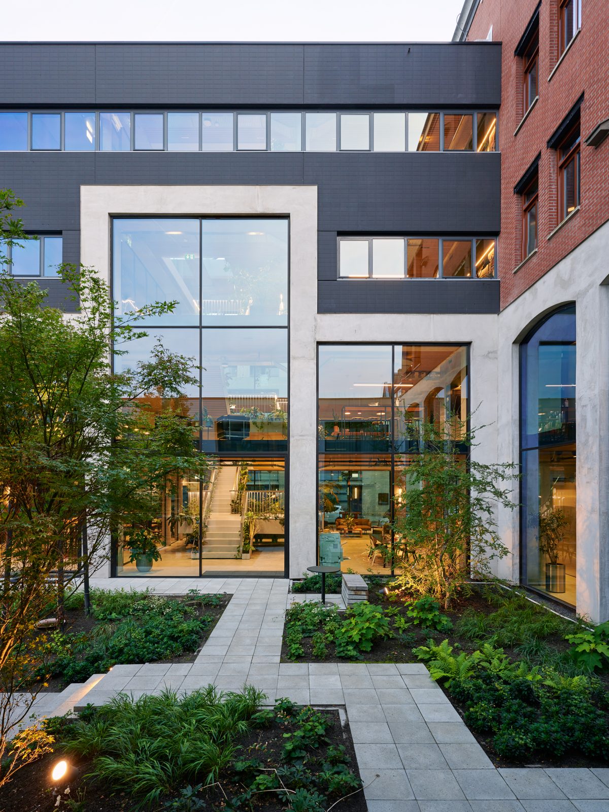
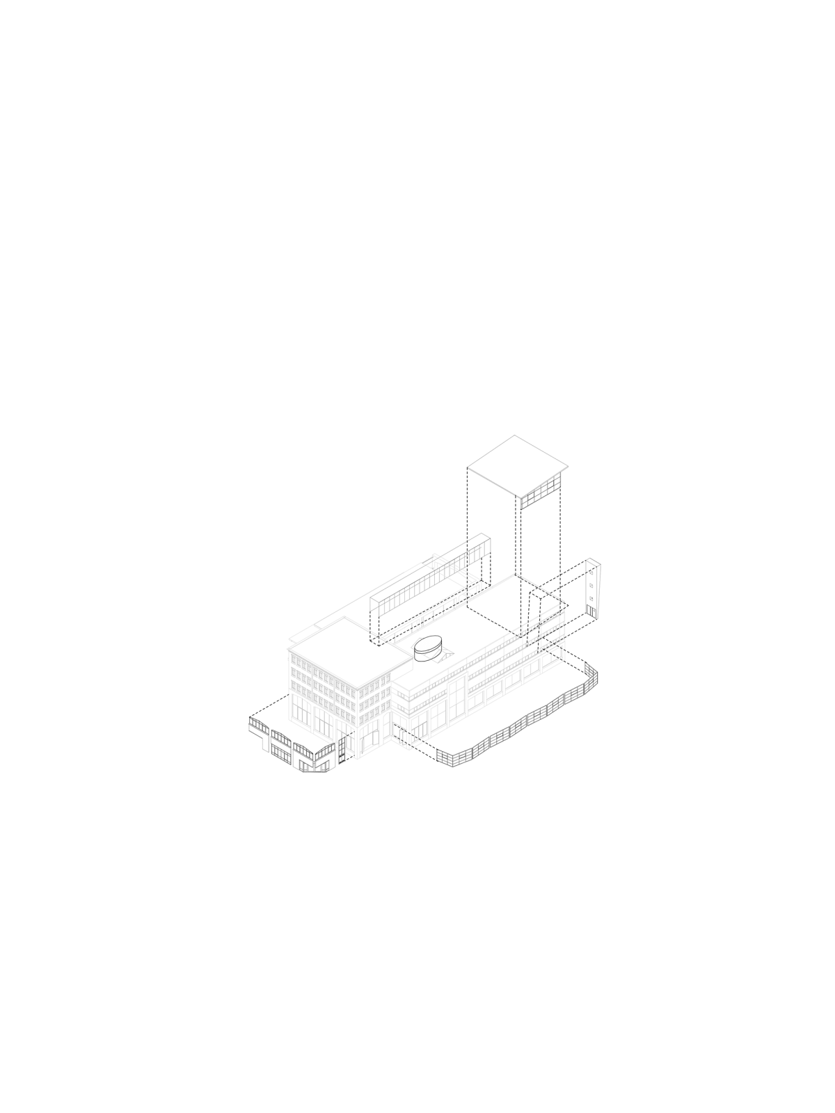
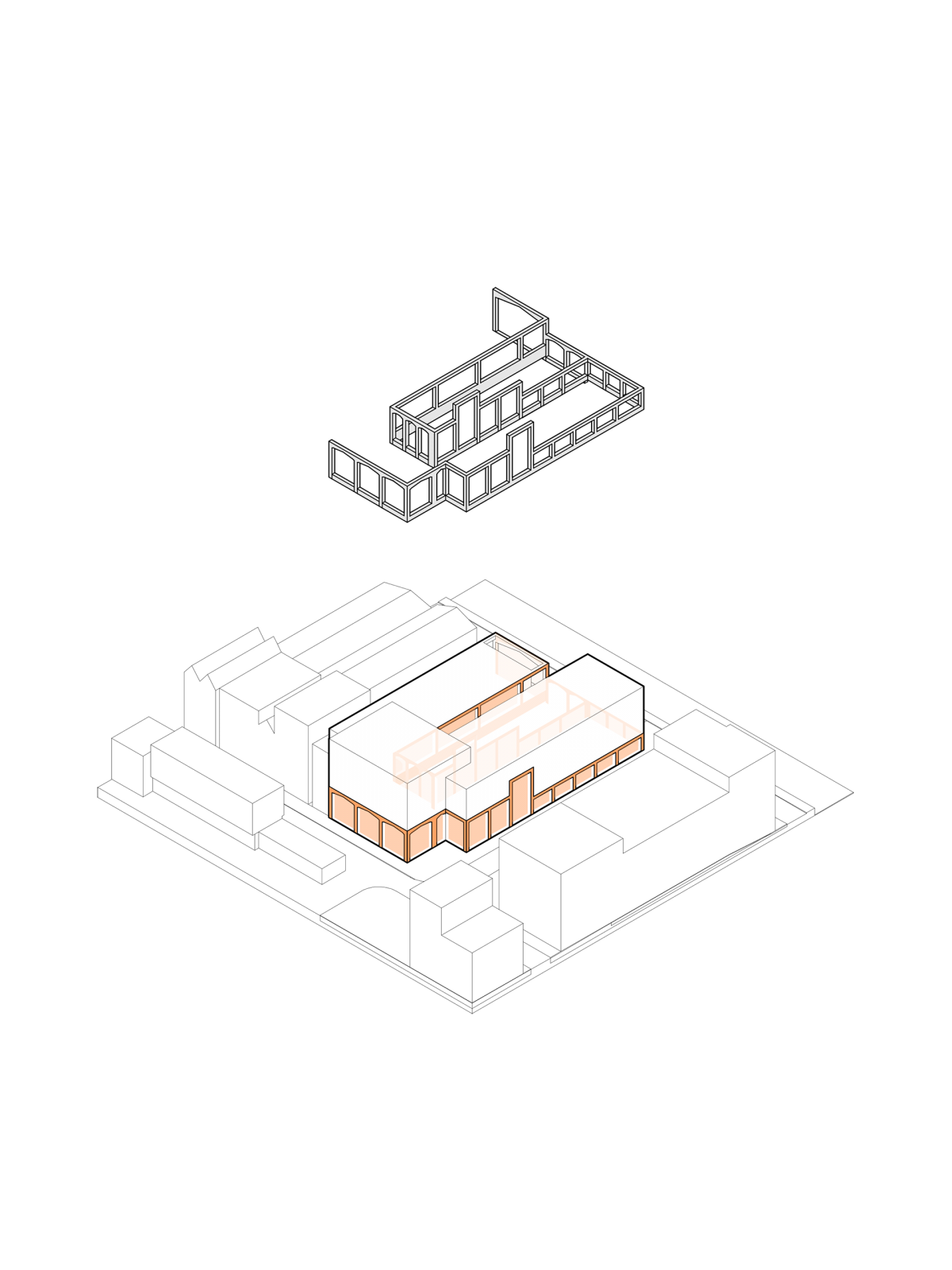
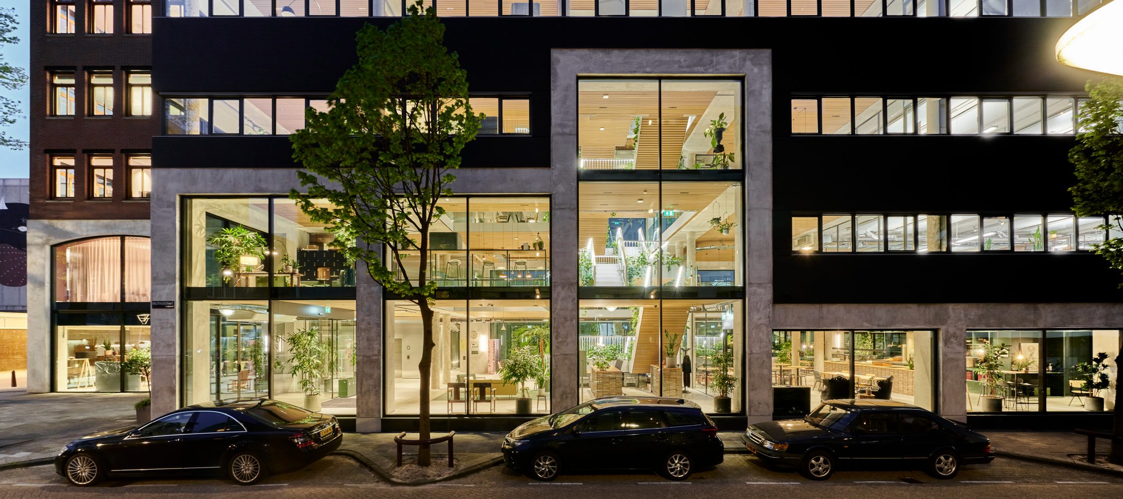
The new facades are characterised by the concrete structure that binds original buildings together like a ribbon, giving the headquarters a powerful presence. The continuous windows establish connection between the inner world and the street. In the large space at the heart of the building lies a green atrium flooded with natural light all around.
The concept of connection guides the design: connecting the existing buildings, connecting people and connecting with the neighbourhood.
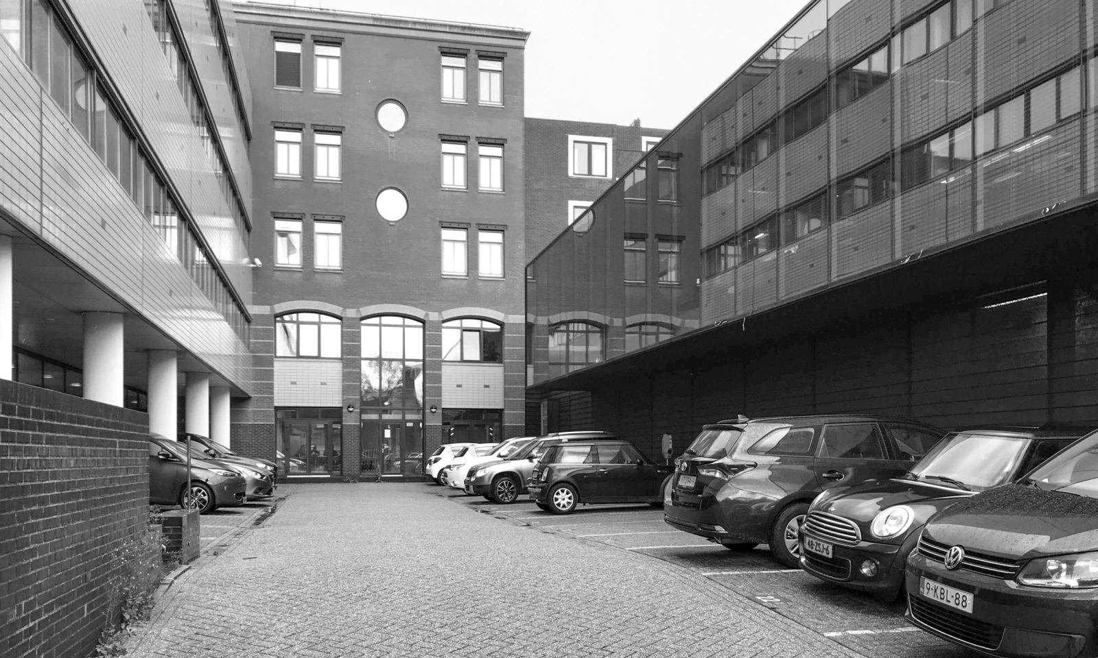
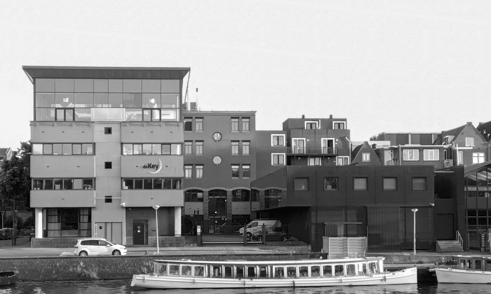
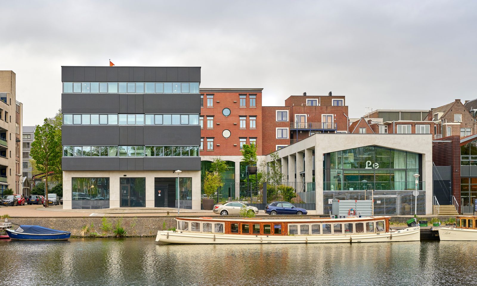
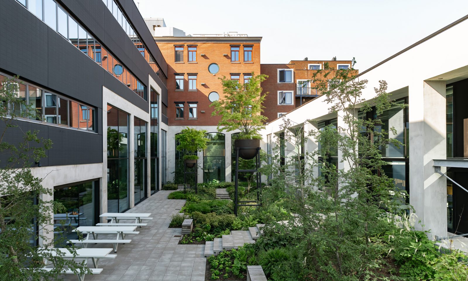
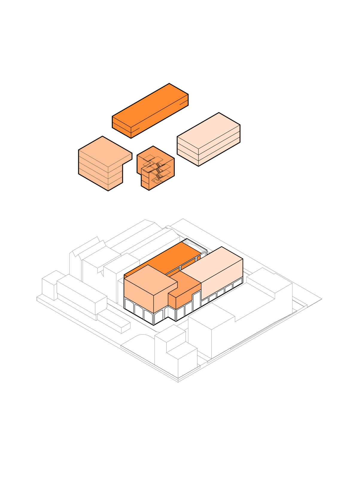
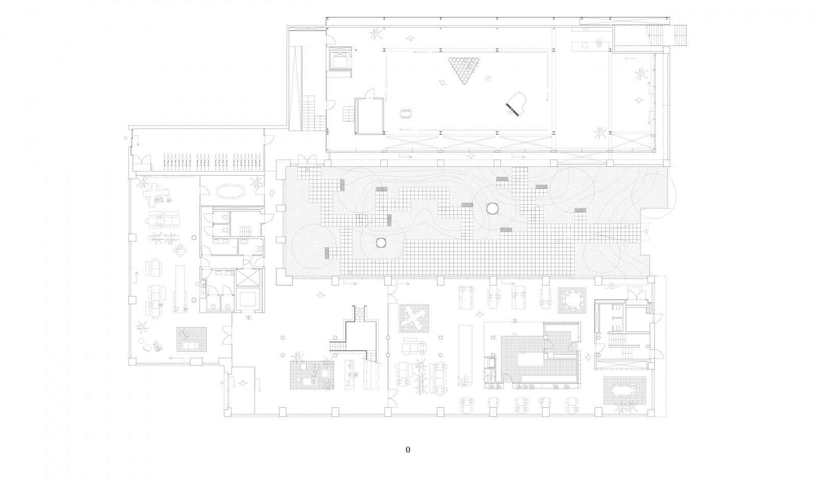
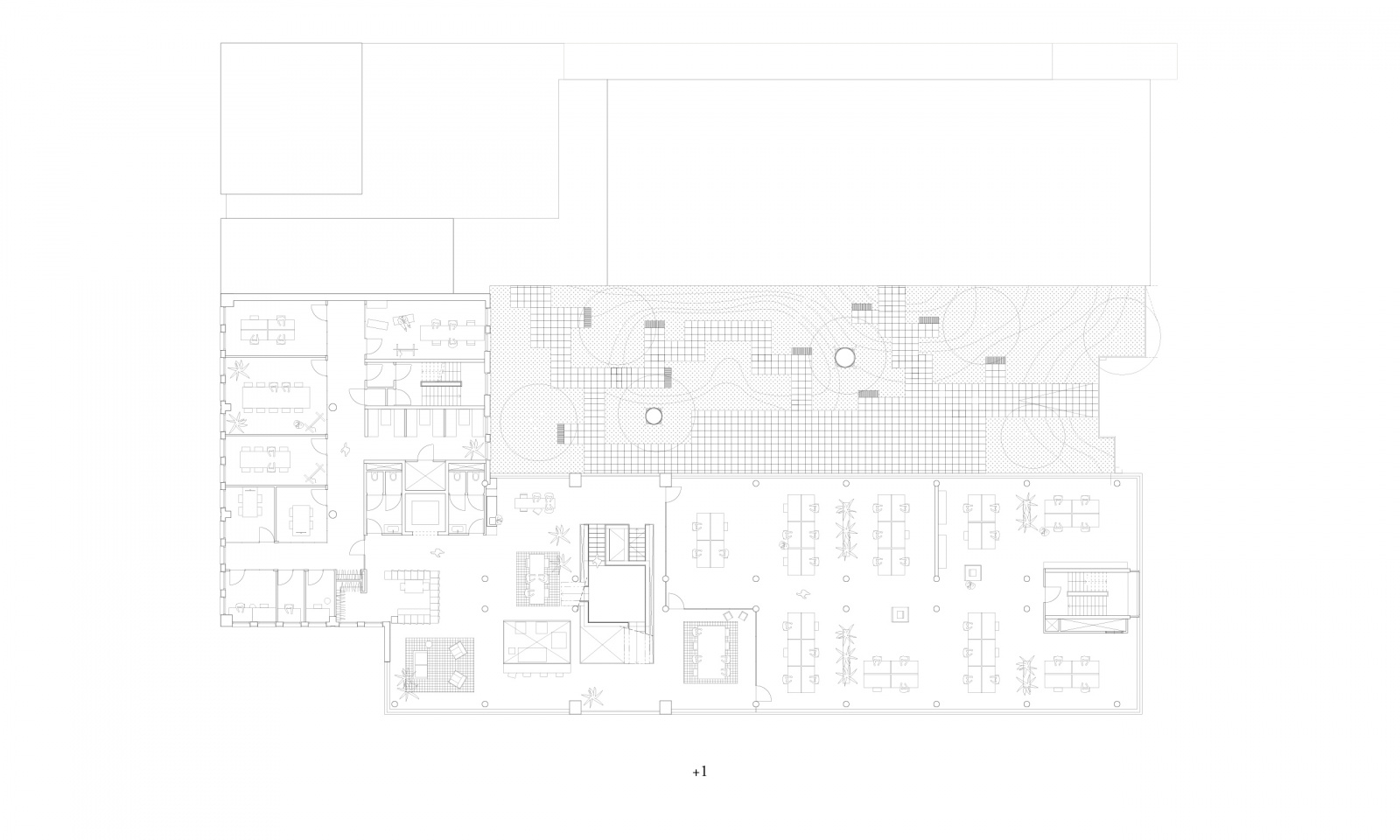
Our starting point for the design was the theme of connection – of people, of the existing buildings and with the neighbourhood. Linking the three original buildings together gave us the opportunity to create a fully opened ground floor, a dynamic landscape with inspiring spaces for joint meetings and informal interactions. The flexible workspaces not only facilitate diverse programmes and users, but promote efficiency by accommodating more people in the same buildings.
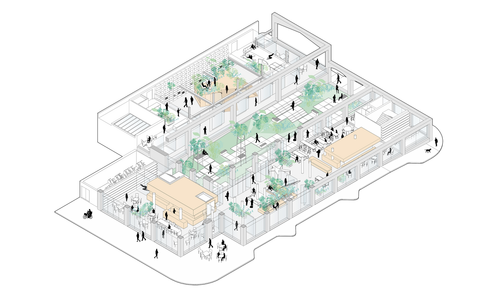
Opening up the ground floor spaces and the office areas links the varying programmes and users, and unites the three separate building elements.
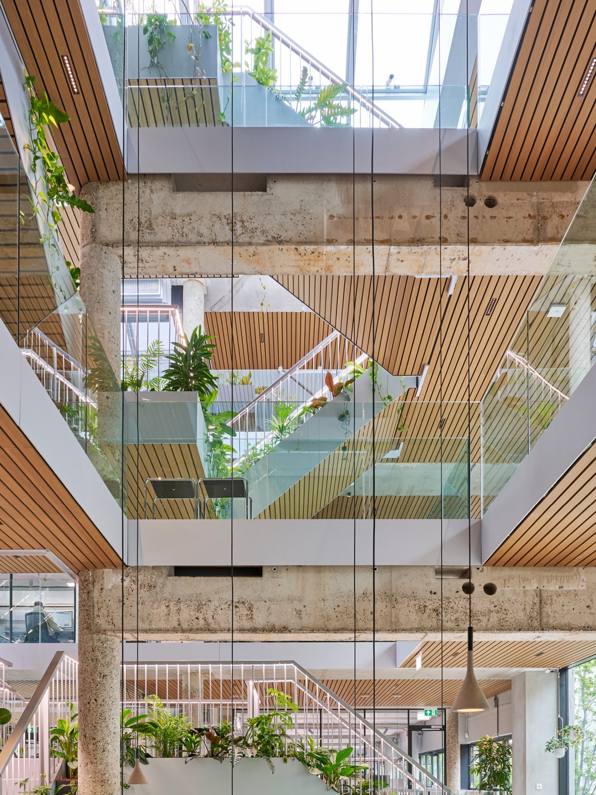
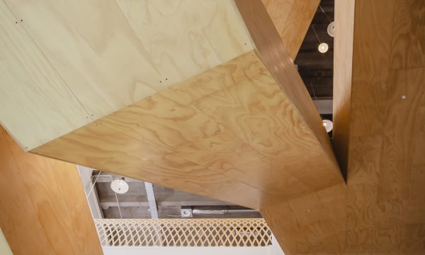
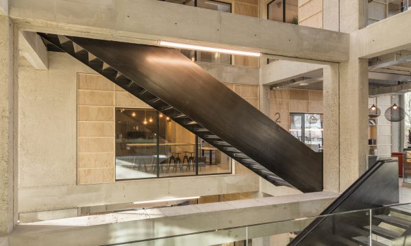
Across the full height of the atrium rises the central staircase, the building’s green lung and an eye-catcher from the street. The staircase is typified by the split-level plateaus, which act as shortcuts and new places for spontaneous interactions between colleagues. Given the dynamics on the staircase, the collective work functions are grouped around it and the activities that require more quiet or concentration are placed at a distance.
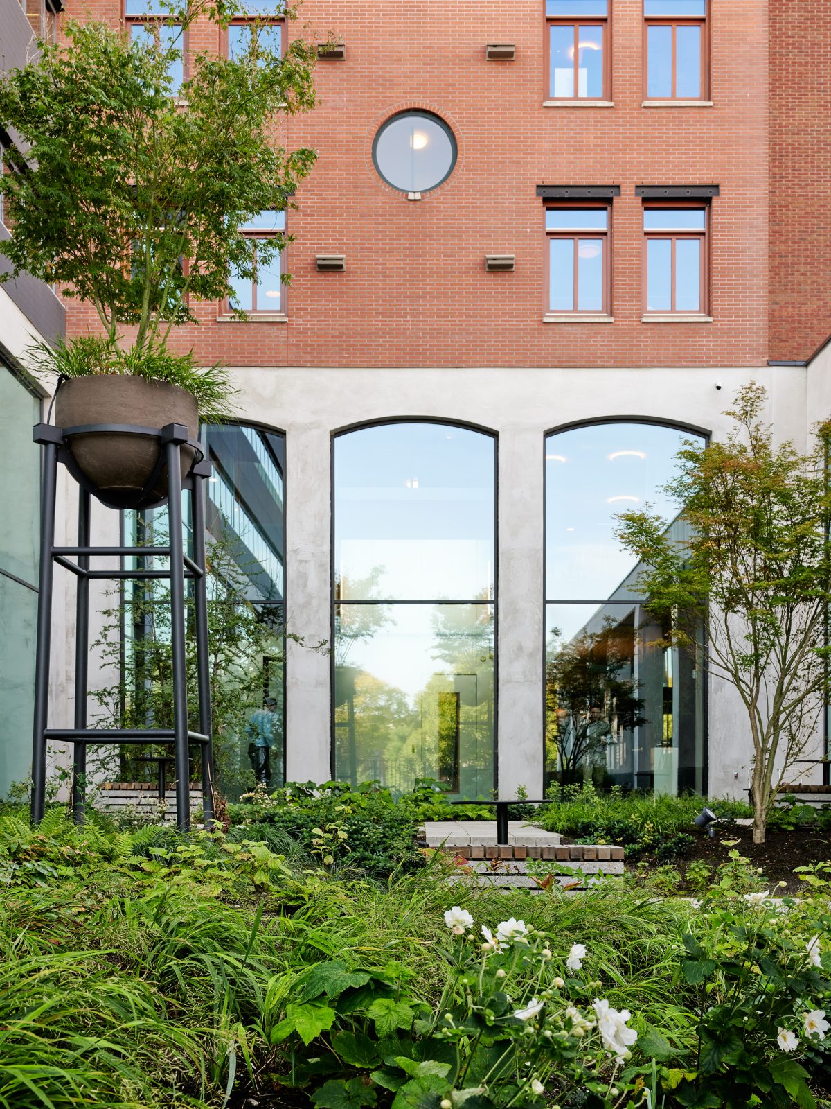
At the heart of the ground floor is the lush courtyard garden. This green space seems to continue into the Werklab and restaurant via the open facades on either side, and catches the eye from the Nieuwe Vaart canal. In good weather, the facades can be opened all around, so that the garden also becomes an integral part of the open ground floor.
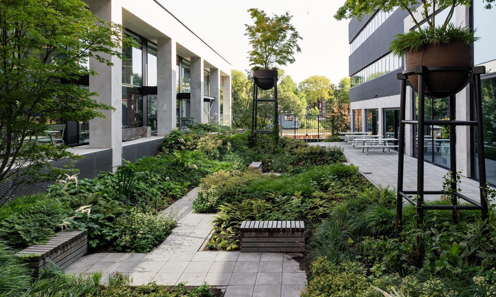
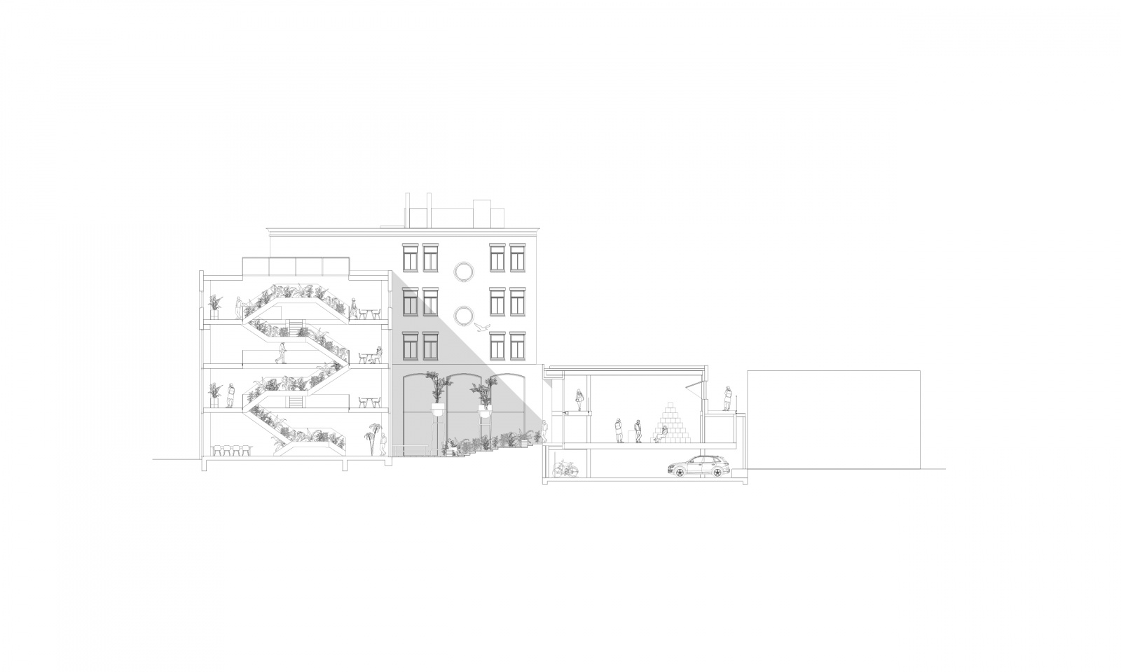
New internal and external interventions underline the guiding themes of connection and transparency.
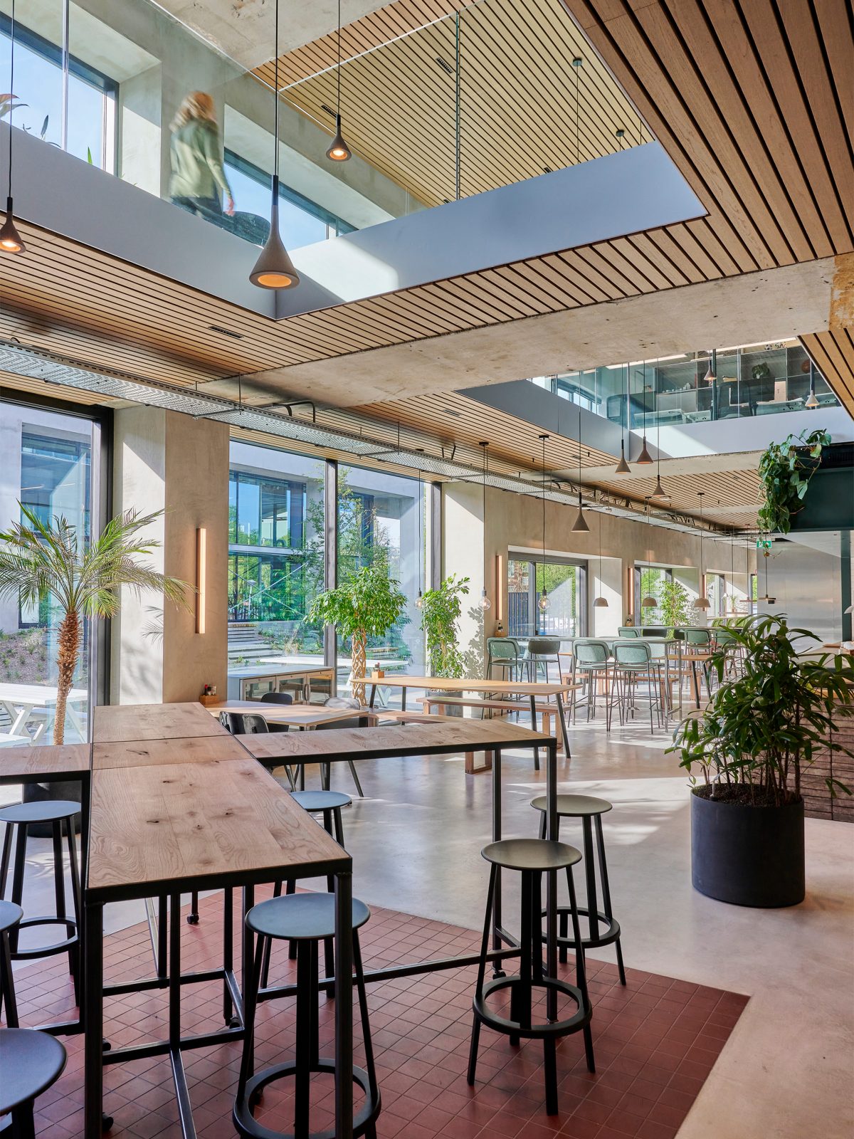
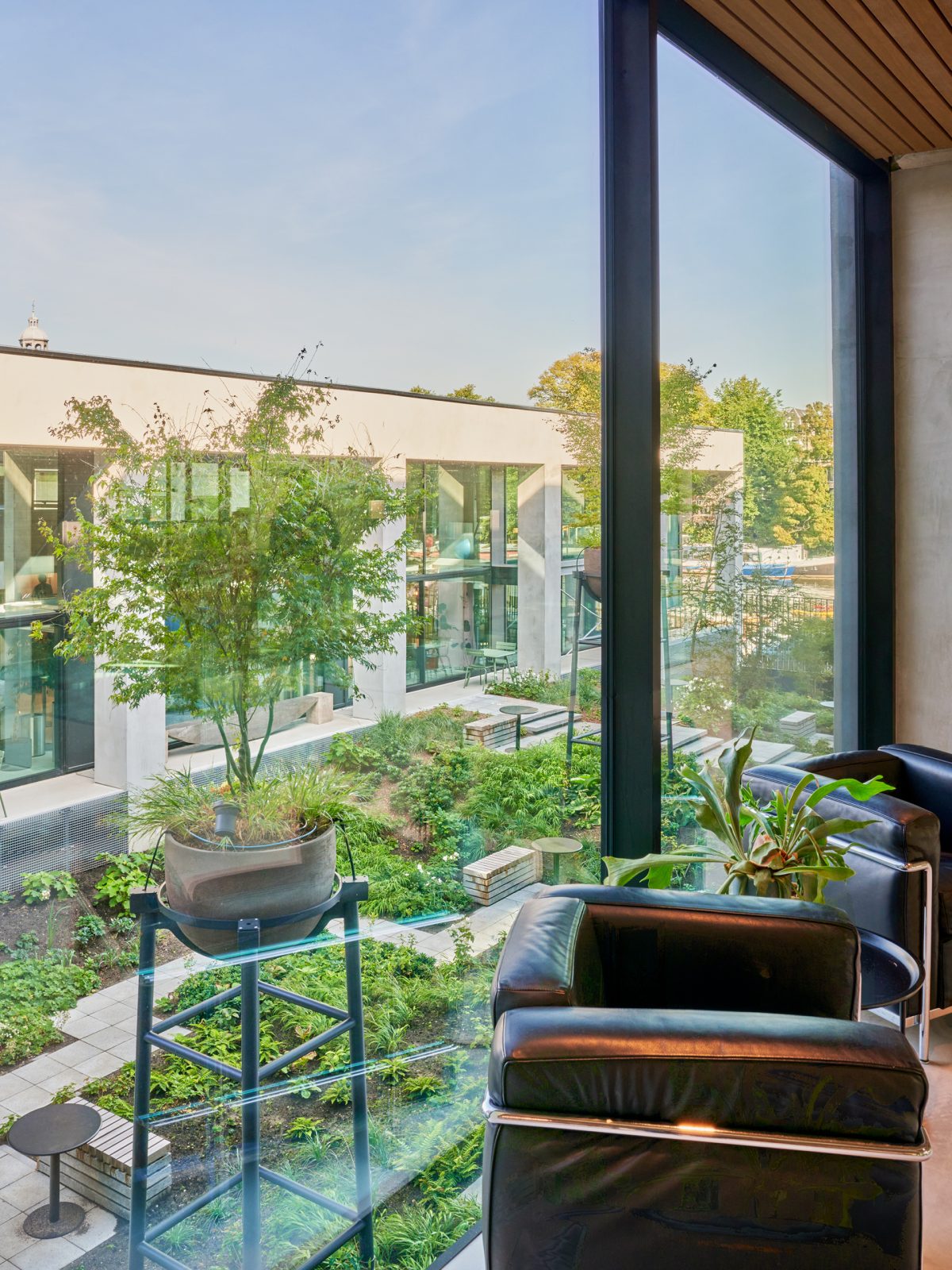
Instead of adding materials, we aimed to remove as many as possible. This not only creates more unobstructed heights and transparency, but also contributes greatly to the building’s sustainability score. The frames in the concrete structure that provides the building with its identity refer to the characteristic arch elements in the buildings in the surrounding area.
