
Akropolis | De Generaal
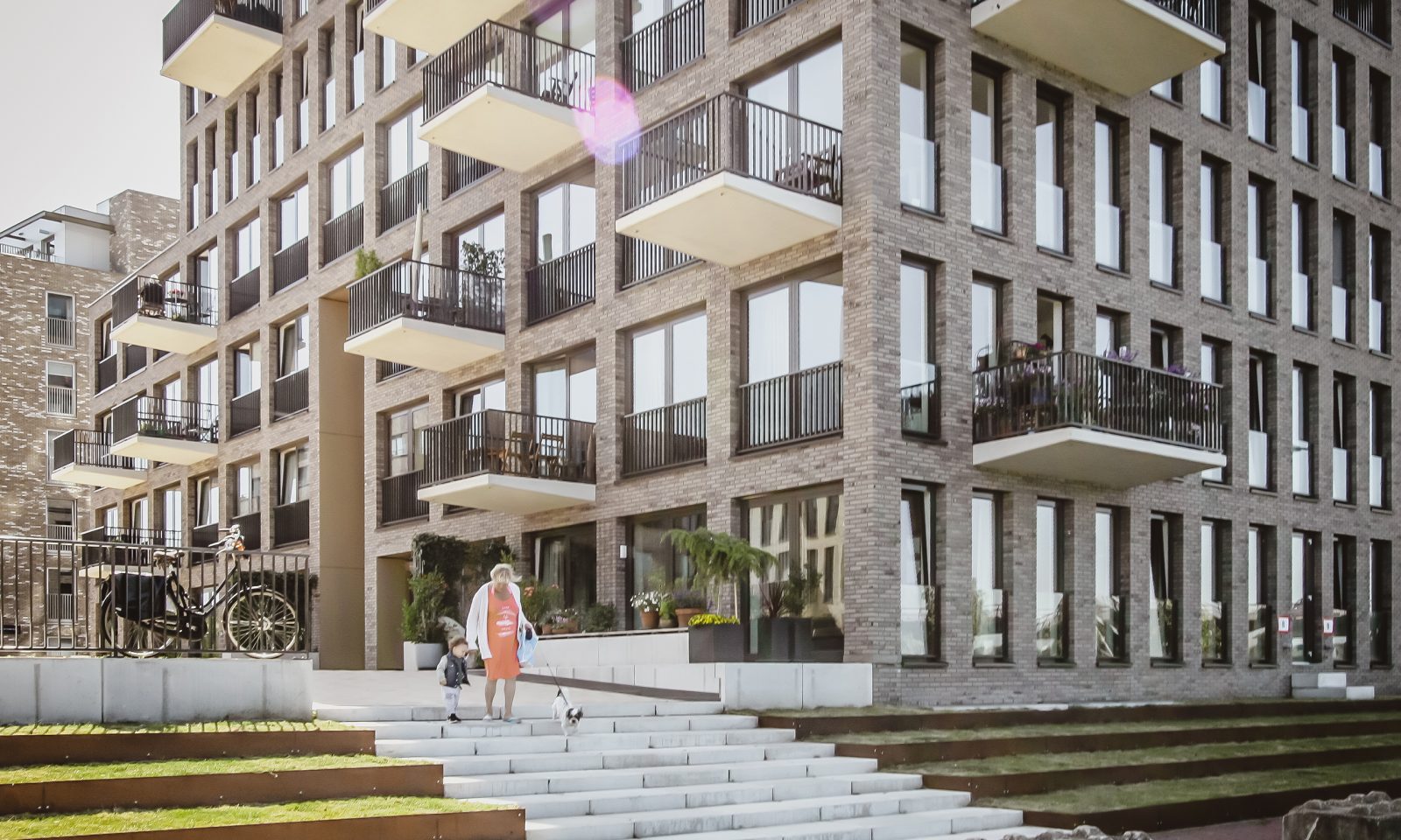
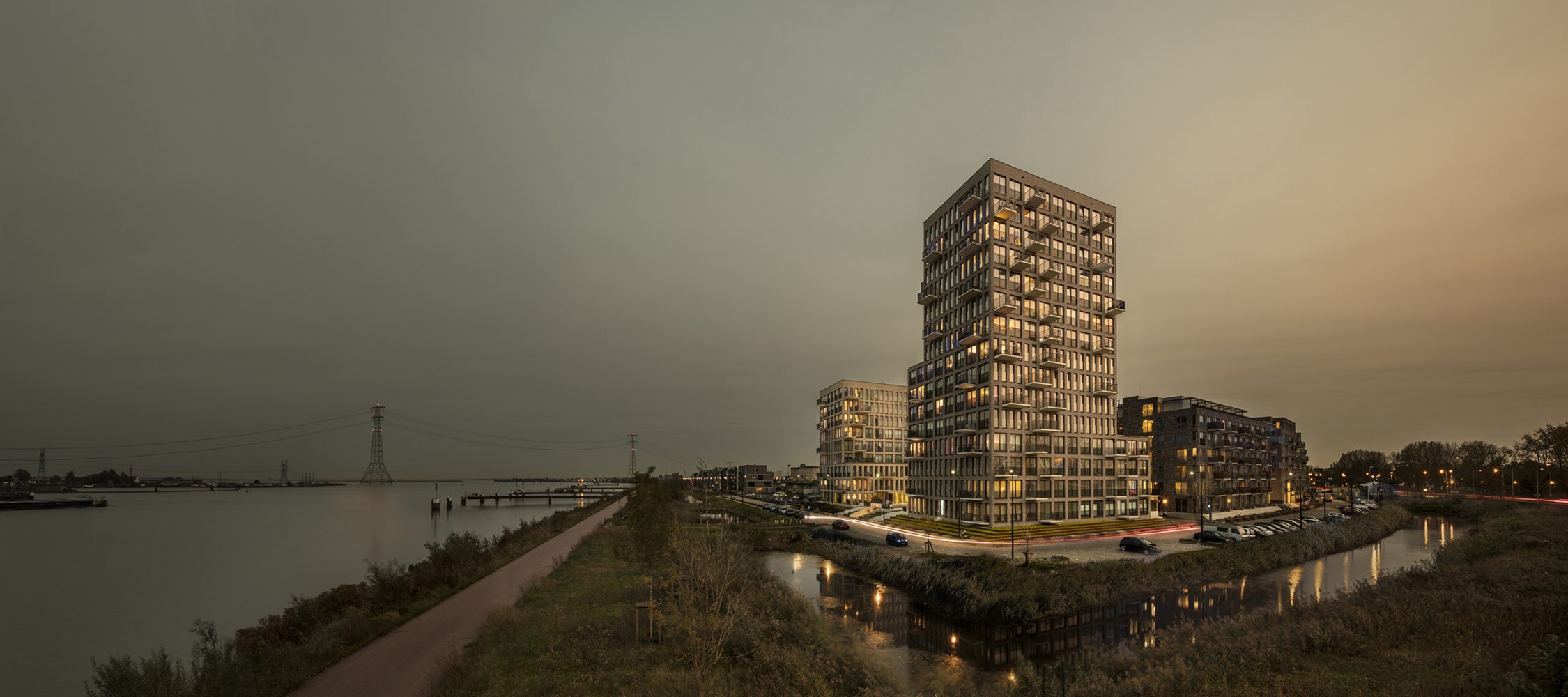
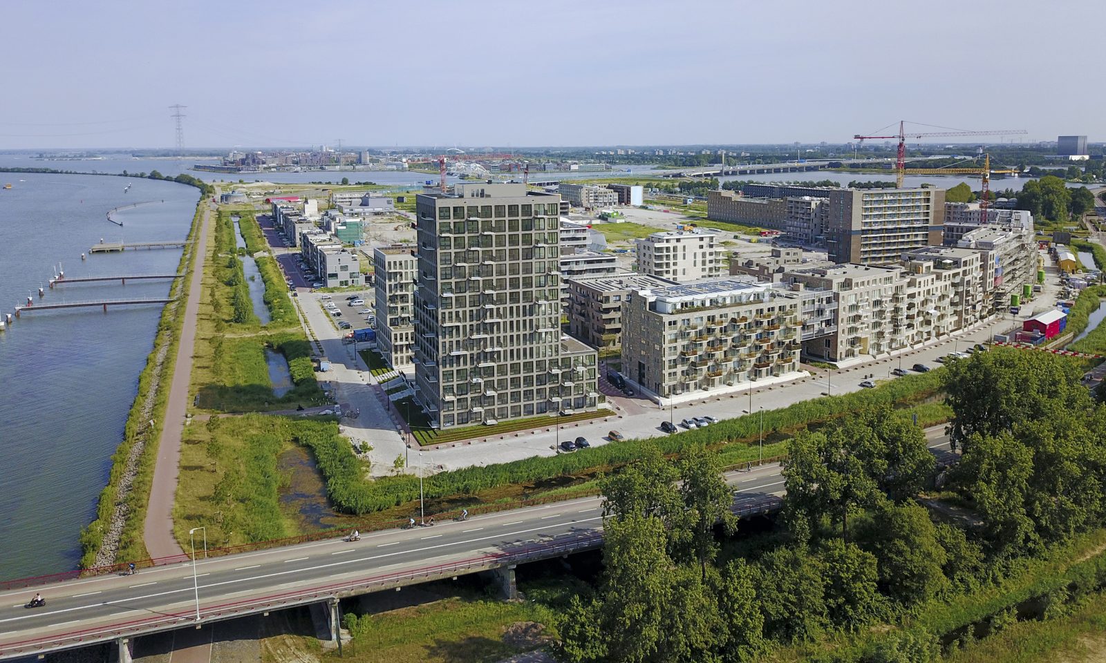
Recognisable by their stepped silhouettes and alternating façade rhythms, Akropolis and De Generaal form striking landmarks that signal the northern entrance to Zeeburgereiland in Amsterdam. All 142 residences – a combination of private and social housing – are orientated towards the magnificent views.
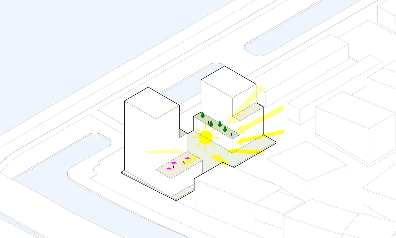
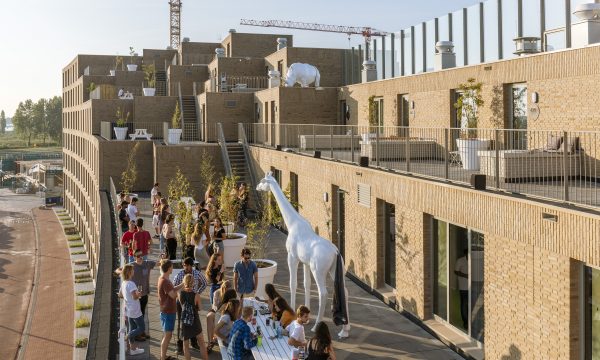
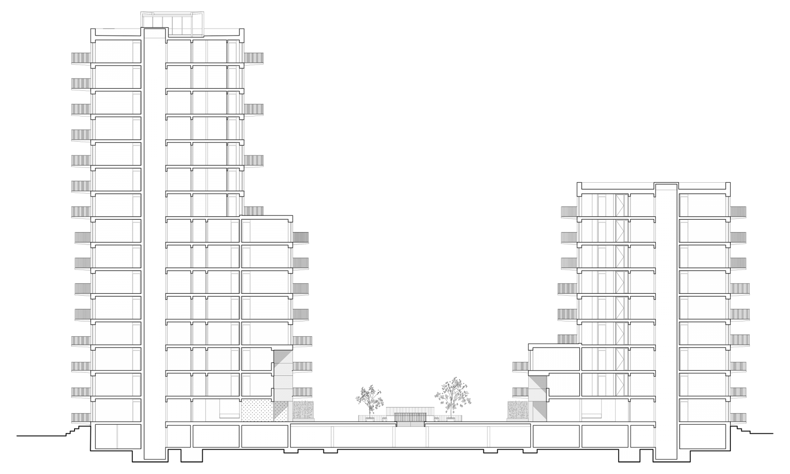
As opposed to two low, wide buildings, as originally planned, the design comprises two high, slender buildings that rest atop a semi-underground car park. This creates more space between the buildings to maximise views and also results in a generous courtyard deck which is shared by residents. The building’s open profile frames wide views of the Buiten-IJ for the neighbourhood to enjoy. As the volumes recede every few storeys in response to surrounding buildings, this create setbacks for private outdoor spaces and green roofs.
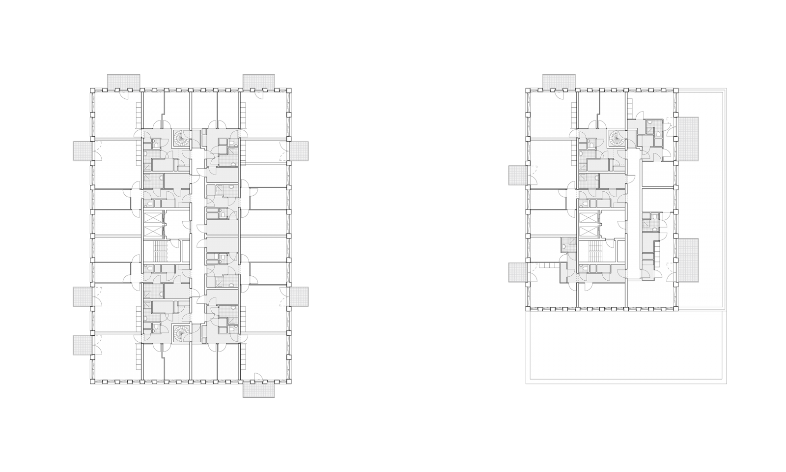
With a compact structure, the buildings are efficiently organised around a core that integrates all the apartments’ functional spaces. The living room and bedrooms are then positioned on the perimeter to maximise views. This quality of space is accessible for every resident regardless of whether the apartment is allocated for private or social housing. A community centre on ground floor helps activate the courtyard space.
Project details
Client
de Alliantie, LingottoType
142 apartments, collective facilities, parking, general practitioner; 10.872m2Location
Kea Boumanstraat, Zeeburgereiland, Amsterdam, NLDesign-Completion
2014-2017Design team
Albert Herder, Vincent van der Klei, Metin van Zijl, Arie van der Neut, Wouter Hermanns, Stijn de Jongh, Joost Maatkamp, Lesia TopolnykImage credits
Peter Cuypers, Laura Miezite, drone shot: Luuk KramerA new landmark on Zeeburgereiland.

Recognising a growing need for better collective and public urban spaces we conceived a spatial intervention that functions as a catalyst for connection between residents and as an open profile that frames wide views for the neighbourhood to enjoy.
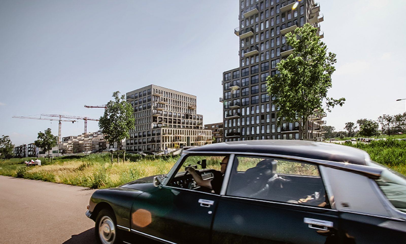
Instead of a massive block, the design houses the required functions in two high, slender buildings resting atop a shared, semi-underground car park. Both complexes become narrower towards the top. The volumes step up and recede every few storeys in response to surrounding buildings. This reduces the amount of apartments per floor, which creates setbacks that are used for private outdoor spaces and green roofs.
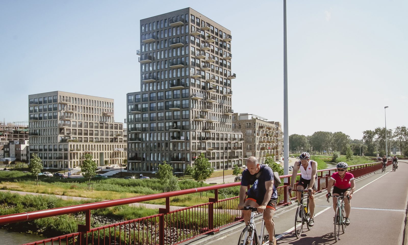
The buildings have a compact structure organised around a core that contains all the apartments’ functional spaces.
The living room and bedrooms are positioned on the perimeter to maximise views. This quality of space is accessible for every resident regardless of whether the apartment is allocated for private or social housing.
Fronting all sides, the buildings feature two stacked and alternating facade rhythms which step accordingly – this strengthens the recognisability of and interrelationship between the two buildings.
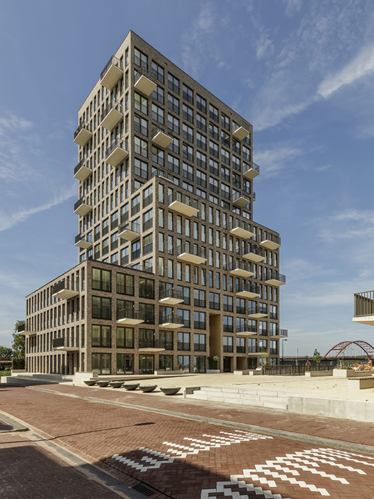
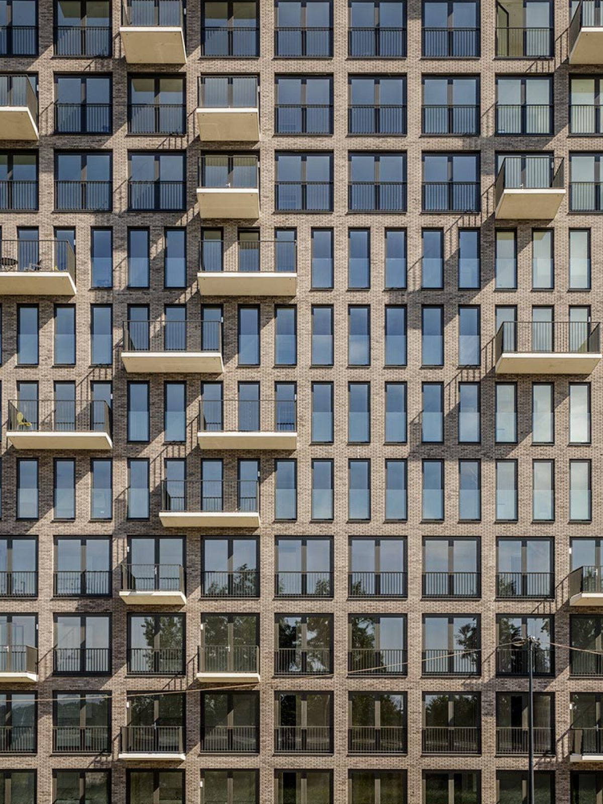
Can the structure of the facade become the logo of the project?

